Review and repair
Fix the cause, not every imperfection.
A handwriting font should still look handwritten. Review blockers first, test words in the preview, and use the smallest correction that solves the problem.
Recommended order
Review the whole font first
- 01Start with the review state. Open warnings before polishing characters that are already usable.
- 02Type a few real words in the preview. Look for size, baseline, and spacing problems across several letters.
- 03Select a character and adjust scale, baseline, spacing, skew, or weight when the shape itself is sound.
- 04Use mask repair for small gaps, joins, or specks. Apply the repair to retrace the character.
- 05Redraw or import again when the source is clipped, badly blurred, or needs a substantially different shape.
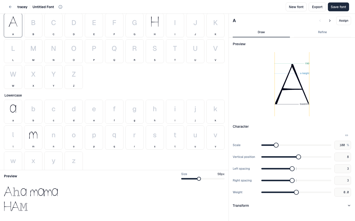 The Refine tab adjusts placement and spacing while the specimen remains visible for comparison.
Choose a tool
Match the fix to the problem
- Adjust: the character is recognisable but sits too high, low, large, small, tight, or loose.
- Repair: the imported mask has a small gap, stray mark, or broken join.
- Reassign: the shape belongs to a different character. If that character is occupied, choose whether to replace it or keep an alternate.
- Import again or redraw: the source is clipped or the intended form is substantially different.